How Awesome Is It to Find New Comic Art in My Inbox?
With THREE new comics in production, I see a LOT of new art each week.
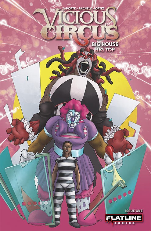
Last week, I previewed some of the new Amanda Rachels/Alivon Ortiz artwork for Vicious Circus: Big House Big Top, the first issue of our next big killer clown epic that’s launching on Kickstarter in just six days, on Sunday, August 25. One of the true joys of self-publishing comics is seeing those new pages of art and colors materialize from our creative mind-meld into actual pieces of finished art in my email.
This is the first long-form Vicious Circus story from Amanda and I in a few years, so we’re excited to combine our powers on it again. Rewards include two variant covers, a silver metal cover edition, and deluxe format versions with creator autographs and an interior remarque sketch. 24 big pages of killer clown chaos all centered in a women’s prison!
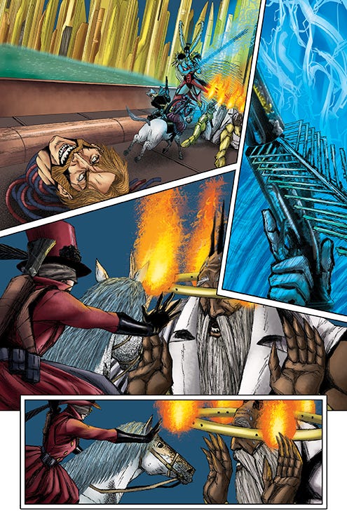
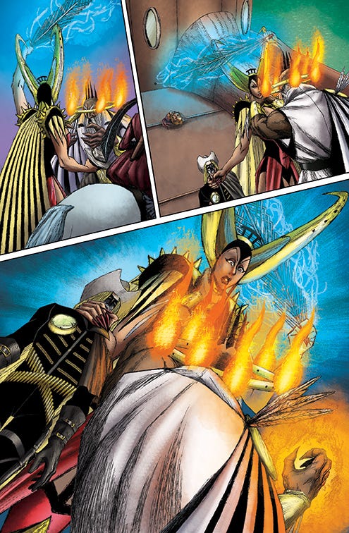
The other book for which I’m seeing a steady stream of pages is Last Ride of the 4 Horsemen: Tribulation, as half the art from issue 2 of the series is complete. This one picks up where issue 1 left off, as the Horseman Death, Cager Dobbin, leads his own cadre of 4 Horsemen on an all-out assault on the higher powers that unleashed the original Horsemen to destroy his home and, indeed, his world. Let me share a page of completed art from issue 2 and reverse engineer it to illustrate how it was made.
There’s a gorgeous page of weird action and vibrant color. Starting with the disembodied head of dread villain Wilbur Fairless, we find our heroes Cager (Death) and Dabble (Suicide) on the attack in background, followed by a close-up of a weapon sparking blue arcs of electricity. Then, Dabble defiantly confronts one of our new enemies with her devastating powers. Let’s look at the script for this page to get a better understanding of the goings-on:
Panel 1
In close foreground, the smirking head of WILBUR FAIRESS lies sideways facing us on the deck of the ship, eyes cut upward and back in a vain effort to see behind him.
Behind him, SUICIDE pulls rightward on the reins of the PALE HORSE, who materializes as she skids sideways to a lurching stop on the deck, just before the palms-out, cowering DR. WAY. DEATH leaps to dismount and face BILSA, vaulting over his right arm pressed to the horse’s haunches, pistol brandished threateningly in his opposite hand. His eyes are directly on FAIRLESS.
BILSA, double-fisting her sword before her like Conan the Barbarian, rushes at DEATH.
DEATH
WELL, I’LL BE FEATHERED. IS’AT YOU, WILBUR?
DEATH
ROLLIN’ AROUND LIKE A PRICKLY PEAR ON A WHIRLYGIG?
FAIRLESS
MORE LIKE A GRENADE ON A ROULETTE WHEEL, BUT, YES, IT’S ME, OLD BOY.
FAIRLESS
STUCK WITH YOU LIKE A SQUEAKY AXLE ON A RUSTY STEAMPLOW.
Panel 2
BILSA slashes violently at DEATH’s pistol with her sword, cleaving it in two and shocking his hand with electricity. He yelps in pain and releases his grip on the destroyed weapon.
BILSA
WAIT TO RENEW YOUR ACQUAINTANCE ASIDE EACH OTHER ON MY VICTORY SMORGASBORD, CRETINS.
BILSA
MY FINAL VICTORY AS I FIX MY OWN LOSSES IN PERPETUITY IN THE NAME OF SPORTSMANSHIP.
DEATH
HOT DAMN!
Panel 3
SUICIDE, still on the battle-ready PALE HORSE and arm extended palm-out, looks face-to-face with the massive, yet cringing, DR. WAY.
DR. WAY
BILSA, THEY HAVE ME! YOU HEDGED YOUR BET, FRAULEIN! THEY’LL KILL ME NOW!
SUICIDE
OH, I DON’T KILL NOBODY, MISTER.
SUICIDE
THE NEW ME CONVINCES’EM TO DO THAT ALL BY THEIR LONESOME.
Panel 4
Profile.
Smirking, SUICIDE leans down and toward the entranced, agape DR. WAY, her open, outstretched palm only inches from him.
SUICIDE
LIKE, BY TURNIN’ THEIR OWN WEAPON AGAINST’EM.
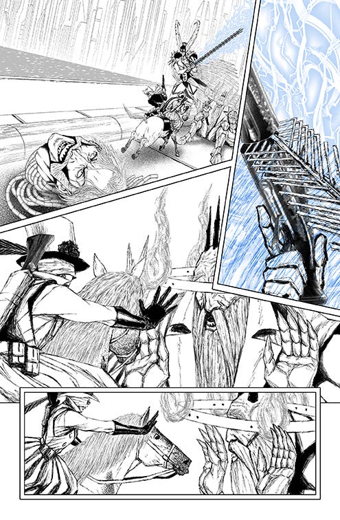
And here’s what Marco drew before colors, based on the script:
So, I get the singular joy of experiencing the arrival of new art twice per piece, as the artist delivers the penciled/inked pages, followed by the colorist delivering the finally rendered version, complete with textured, chromatic masterpieces. My feedback is typically tinged with awe and compliments, as I’m fortunate to work with instinctive, brilliant artists who get what I’m doing and what I’m going for in a story.
In the case of the page at hand, Marco took some smart liberties with perspective and framing, particularly in panels 2 and 4, and he makes each dramatically more appealing with his judgment calls. He tightens the scale on panel 2, focusing down on the interactions of the weapons, and he relaxes the perspective in panel 4, obviating the size differential between Dabble and Dr. Way but showing her in complete control in this instance. These are the little unexpected bonuses I get to enjoy as the writer when I open a new piece of art in my email. Just for shits and giggles, check out the next page in the sequence:
You can follow what happens next without any verbiage to guide you. I especially love the chokehold Marco put on Cager via Bilsa in panel 3. Awesome stuff. That one made me chuckle when it popped out of its email attachment purgatory.
If you haven’t checked out this series yet, the first full issue is available in our web store:
I hope you enjoyed this little glimpse into my comic art inbox. I’ll share more soon!
Have a great week!
Kevin


